Cross Validation
Although hypothesis tests provide a way to compare nested linear models, in many situations the approaches under consideration don’t fit nicely in this paradigm. Indeed, for many modern tools and in many applications, the emphasis lies on prediction accuracy rather than on statistical significance. In these cases, cross validation provides a way to compare the predictive performance of competing methods.
This is the second module in the Linear Models topic.
Overview
Learning Objectives
Implement cross validation to assess the predictive value of a model using tools for iteration.
Video Lecture
Example
I’ll write code for today’s content in a new R Markdown document
called cross_validation.Rmd in the
linear_models directory / repo. The code chunk below loads
the usual packages (plus mgcv) and sets a seed for
reproducibility.
library(tidyverse)
library(modelr)
library(mgcv)
## Loading required package: nlme##
## Attaching package: 'nlme'## The following object is masked from 'package:dplyr':
##
## collapse## This is mgcv 1.9-3. For overview type 'help("mgcv-package")'.library(p8105.datasets)
set.seed(1)CV “by hand”
We’ll start with a simulated example. The code chunk below imports data that is non-linear and shows increasing variance as the predictor increases. I like to use this setting because “model complexity” is easiest for me to understand when I can see it. However, “model complexity” is also an issue when you’re dealing with lots of predictors – you can’t “see” overfitting as easily, but it definitely happens.
data("lidar")

lidar_df =
  lidar |>
  as_tibble() |>
  mutate(id = row_number())

lidar_df |>
  ggplot(aes(x = range, y = logratio)) +
  geom_point()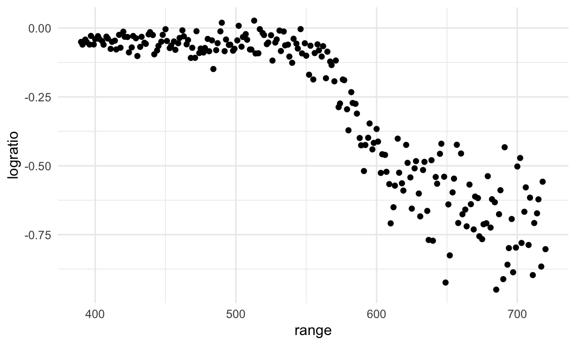
I’ll split this data into training and test sets (using
anti_join!!), and replot showing the split. Our goal will
be to use the training data (in black) to build candidate models, and
then see how those models predict in the testing data (in red).
train_df = sample_frac(lidar_df, size = .8)
test_df = anti_join(lidar_df, train_df, by = "id")

ggplot(train_df, aes(x = range, y = logratio)) +
  geom_point() +
  geom_point(data = test_df, color = "red")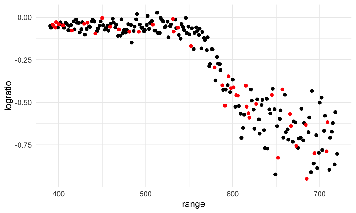
I’ll fit three three models to the training data. Throughout, I’m
going to use mgcv::gam for non-linear models – this is my
go-to package for “additive models”, and I much prefer it to
e.g. polynomial models. For today, you don’t have to know what this
means, how gam works, or why I prefer it – just know that
we’re putting smooth lines through data clouds, and we can control how
smooth we want the fit to be.
The three models below have very different levels of complexity and aren’t nested, so testing approaches for nested model don’t apply.
linear_mod = lm(logratio ~ range, data = train_df)
smooth_mod = mgcv::gam(logratio ~ s(range), data = train_df)
wiggly_mod = mgcv::gam(logratio ~ s(range, k = 30), sp = 10e-6, data = train_df)
To understand what these models have done, I’ll plot the two
gam fits.
train_df |>
  add_predictions(smooth_mod) |>
  ggplot(aes(x = range, y = logratio)) +
  geom_point() +
  geom_line(aes(y = pred), color = "red")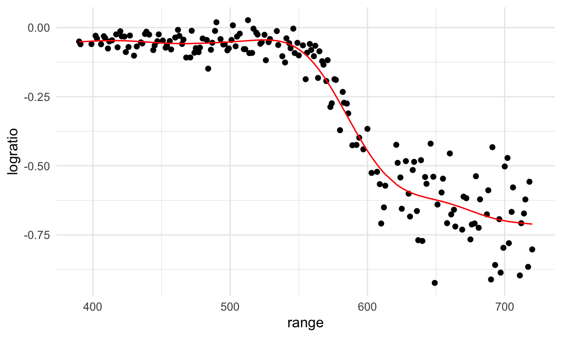
train_df |>
  add_predictions(wiggly_mod) |>
  ggplot(aes(x = range, y = logratio)) +
  geom_point() +
  geom_line(aes(y = pred), color = "red")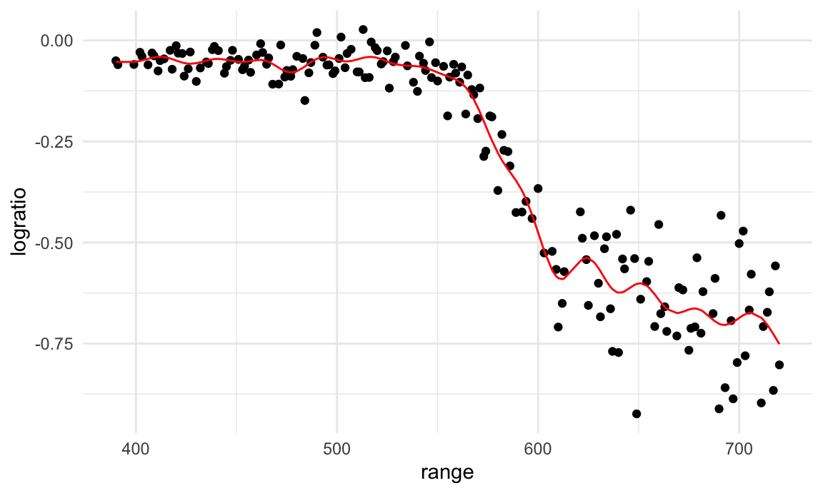
In a case like this, I can also use the handy
modelr::gather_predictions function – this is, essentially,
a short way of adding predictions for several models to a data frame and
then “pivoting” so the result is a tidy, “long” dataset that’s easily
plottable.
train_df |>
  gather_predictions(linear_mod, smooth_mod, wiggly_mod) |>
  mutate(model = fct_inorder(model)) |>
  ggplot(aes(x = range, y = logratio)) +
  geom_point() +
  geom_line(aes(y = pred), color = "red") +
  facet_wrap(~model)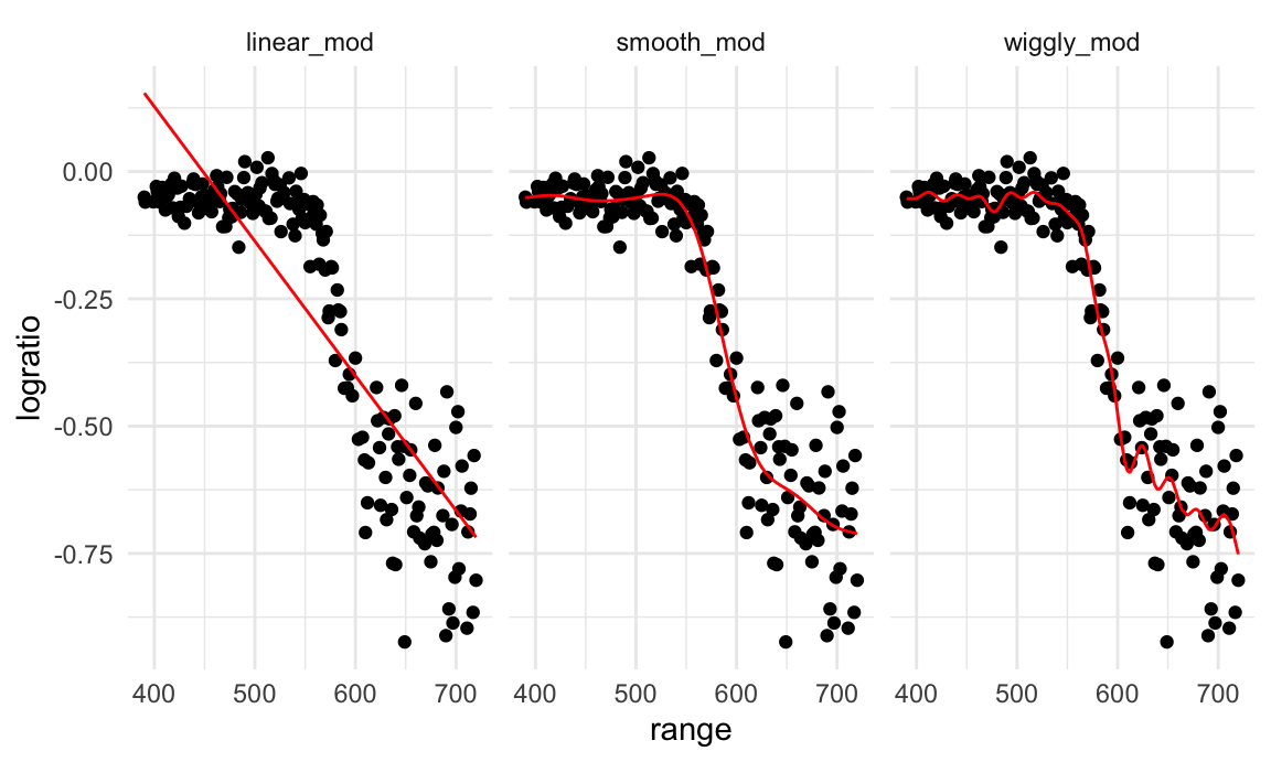
A quick visual inspection suggests that the linear model is too
simple, the standard gam fit is pretty good, and the wiggly
gam fit is too complex. Put differently, the linear model
is too simple and, no matter what training data we use, will never
capture the true relationship between variables – it will be
consistently wrong due to its simplicity, and is therefore biased. The
wiggly fit, on the other hand, is chasing data points and will change a
lot from one training dataset to the the next – it will be consistently
wrong due to its complexity, and is therefore highly variable. Both are
bad!
As a next step in my CV procedure, I’ll compute root mean squared errors (RMSEs) for each model.
rmse(linear_mod, test_df)## [1] 0.127317rmse(smooth_mod, test_df)## [1] 0.08302008rmse(wiggly_mod, test_df)## [1] 0.08848557The modelr has other outcome measures – RMSE is the most
common, but median absolute deviation is pretty common as well.
The RMSEs are suggestive that both nonlinear models work better than the linear model, and that the smooth fit is better than the wiggly fit. However, to get a sense of model stability we really need to iterate this whole process. Of course, this could be done using loops but that’s a hassle …
CV using modelr
Luckily, modelr has tools to automate elements of the CV
process. In particular, crossv_mc preforms the training /
testing split multiple times, a stores the datasets using list
columns.
cv_df =
  crossv_mc(lidar_df, 100)
crossv_mc tries to be smart about memory – rather than
repeating the dataset a bunch of times, it saves the data once and
stores the indexes for each training / testing split using a
resample object. This can be coerced to a dataframe, and
can often be treated exactly like a dataframe. However, it’s not
compatible with gam, so we have to convert each training
and testing dataset (and lose that nice memory-saving stuff in the
process) using the code below. It’s worth noting, though, that if all
the models you want to fit use lm, you can skip this.
cv_df |> pull(train) |> nth(1) |> as_tibble()## # A tibble: 176 × 3
## range logratio id
## <dbl> <dbl> <int>
## 1 390 -0.0504 1
## 2 394 -0.0510 4
## 3 396 -0.0599 5
## 4 399 -0.0596 7
## 5 400 -0.0399 8
## 6 402 -0.0294 9
## 7 403 -0.0395 10
## 8 405 -0.0476 11
## 9 406 -0.0604 12
## 10 408 -0.0312 13
## # ℹ 166 more rowscv_df |> pull(test) |> nth(1) |> as_tibble()## # A tibble: 45 × 3
## range logratio id
## <dbl> <dbl> <int>
## 1 391 -0.0601 2
## 2 393 -0.0419 3
## 3 397 -0.0284 6
## 4 412 -0.0500 16
## 5 421 -0.0316 22
## 6 424 -0.0884 24
## 7 426 -0.0702 25
## 8 427 -0.0288 26
## 9 436 -0.0573 32
## 10 445 -0.0647 38
## # ℹ 35 more rowscv_df =
cv_df |>
mutate(
train = map(train, as_tibble),
test = map(test, as_tibble))I now have many training and testing datasets, and I’d like to fit my
candidate models above and assess prediction accuracy as I did for the
single training / testing split. To do this, I’ll fit models and obtain
RMSEs using mutate + map &
map2.
cv_df =
  cv_df |>
  mutate(
    linear_mod  = map(train, \(df) lm(logratio ~ range, data = df)),
    smooth_mod  = map(train, \(df) gam(logratio ~ s(range), data = df)),
    wiggly_mod  = map(train, \(df) gam(logratio ~ s(range, k = 30), sp = 10e-6, data = df))) |>
  mutate(
    rmse_linear = map2_dbl(linear_mod, test, \(mod, df) rmse(model = mod, data = df)),
    rmse_smooth = map2_dbl(smooth_mod, test, \(mod, df) rmse(model = mod, data = df)),
    rmse_wiggly = map2_dbl(wiggly_mod, test, \(mod, df) rmse(model = mod, data = df)))
I’m mostly focused on RMSE as a way to compare these models, and the plot below shows the distribution of RMSE values for each candidate model.
cv_df |>
  select(starts_with("rmse")) |>
  pivot_longer(
    everything(),
    names_to = "model",
    values_to = "rmse",
    names_prefix = "rmse_") |>
  mutate(model = fct_inorder(model)) |>
  ggplot(aes(x = model, y = rmse)) + geom_violin()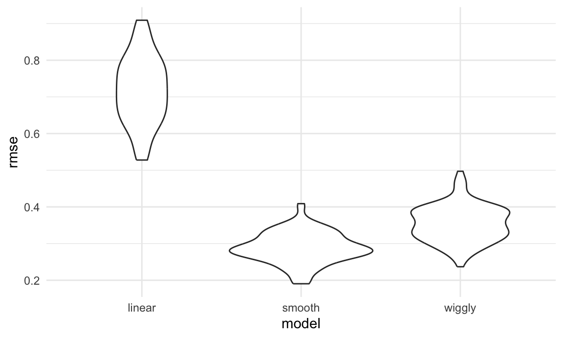
Repeating the split is helpful – now we get a sense of variance in prediction error and can compare prediction error distributions across methods. The smooth fit is a clear winner!
It’s worth remembering, though, that this isn’t testing a null hypothesis and there aren’t p-values as a result.
Example: Child Growth
We’ll take a quick look at an example involving real data and more realistic candidate model. A cross-sectional study of Nepalese children was carried out to understand the relationships between various measures of growth, including weight and arm circumference. You can download the data here; the code chunk below imports the data and plots the variables we’ll focus on.
child_growth = read_csv("./data/nepalese_children.csv")## Rows: 2705 Columns: 5
## ── Column specification ────────────────────────────────────────────────────────
## Delimiter: ","
## dbl (5): age, sex, weight, height, armc
##
## ℹ Use `spec()` to retrieve the full column specification for this data.
## ℹ Specify the column types or set `show_col_types = FALSE` to quiet this message.child_growth |>
ggplot(aes(x = weight, y = armc)) +
geom_point(alpha = .5)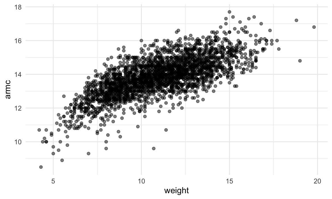
The plots suggests some non-linearity, especially at the low end of
the weight distribution. We’ll try three models: a linear fit; a
piecewise linear fit; and a smooth fit using gam. For the
piecewise linear fit, we need to add a “change point term” to our
dataframe. (Like additive models, for now it’s not critical that you
understand everything about a piecewise linear fit – we’ll see a plot of
the results soon, and the intuition from that is enough for our
purposes.)
child_growth =
  child_growth |>
  mutate(weight_cp7 = (weight > 7) * (weight - 7))
The code chunk below fits each of the candidate models to the full dataset. The piecewise linear model is nested in the linear model and could be assessed using statistical significance, but the smooth model is not nested in anything else. (Also, comparing a piecewise model with a changepoint at 7 to a piecewise model with a changepoint at 8 would be a non-nested comparison…)
linear_mod = lm(armc ~ weight, data = child_growth)
pwl_mod    = lm(armc ~ weight + weight_cp7, data = child_growth)
smooth_mod = gam(armc ~ s(weight), data = child_growth)
As before, I’ll plot the three models to get intuition for goodness of fit.
child_growth |>
  gather_predictions(linear_mod, pwl_mod, smooth_mod) |>
  mutate(model = fct_inorder(model)) |>
  ggplot(aes(x = weight, y = armc)) +
  geom_point(alpha = .5) +
  geom_line(aes(y = pred), color = "red") +
  facet_grid(~model)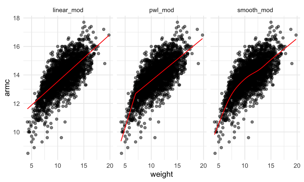
It’s not clear which is best – the linear model is maybe too
simple, but the piecewise and non-linear models are pretty similar!
Better check prediction errors using the same process as before – again,
since I want to fit a gam model, I have to convert the
resample objects produced by crossv_mc to
dataframes, but wouldn’t have to do this if I only wanted to compare the
linear and piecewise models.
cv_df =
  crossv_mc(child_growth, 100) |>
  mutate(
    train = map(train, as_tibble),
    test = map(test, as_tibble))
Next I’ll use mutate + map &
map2 to fit models to training data and obtain
corresponding RMSEs for the testing data.
cv_df =
  cv_df |>
  mutate(
    linear_mod  = map(train, \(df) lm(armc ~ weight, data = df)),
    pwl_mod     = map(train, \(df) lm(armc ~ weight + weight_cp7, data = df)),
    smooth_mod  = map(train, \(df) gam(armc ~ s(weight), data = as_tibble(df)))) |>
  mutate(
    rmse_linear = map2_dbl(linear_mod, test, \(mod, df) rmse(model = mod, data = df)),
    rmse_pwl    = map2_dbl(pwl_mod, test, \(mod, df) rmse(model = mod, data = df)),
    rmse_smooth = map2_dbl(smooth_mod, test, \(mod, df) rmse(model = mod, data = df)))
Finally, I’ll plot the prediction error distribution for each candidate model.
cv_df |>
  select(starts_with("rmse")) |>
  pivot_longer(
    everything(),
    names_to = "model",
    values_to = "rmse",
    names_prefix = "rmse_") |>
  mutate(model = fct_inorder(model)) |>
  ggplot(aes(x = model, y = rmse)) + geom_violin()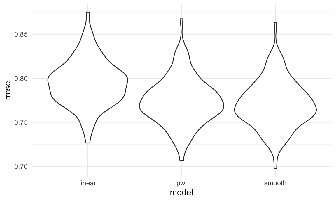
Based on these results, there’s clearly some improvement in
predictive accuracy gained by allowing non-linearity – whether this is
sufficient to justify a more complex model isn’t obvious, though. Among
the non-linear models, the smooth fit from gam
might be a bit better than the piecewise linear model. Which
candidate model is best, though, depends a bit on the need to balance
complexity with goodness of fit and interpretability. In the end, I’d
probably go with the piecewise linear model – the non-linearity is clear
enough that it should be accounted for, and the differences between the
piecewise and gam fits are small enough that the easy
interpretation of the piecewise model “wins”.
Other materials
Cross validation is important, but still a bit new to the tidyverse. Some helpful posts are available, though, including:
- This post has a pretty detailed analysis of K fold CV
- This is a shorter, somewhat more dated example
The Introduction to Statistical Learning with R isn’t free online, but if you can track it down Chapter 5 has some useful material as well.
The code that I produced working examples in lecture is here.