Statistical Learning
Statistical learning methods – both supervised and unsupervised – provide techniques for gaining insights from data. These methods have various goals, including prediction, pattern recognition, and classification; they also vary in complexity and interpretability. This lecture is intended to provide a very broad overview of two methods: lasso and k-means clustering.
Example
As always, I’ll work on today’s example in a GitHub repo + local directory / R Project. This zip file has a couple of datasets we’ll look at.
library(tidyverse)
library(glmnet)
## Loading required package: Matrix##
## Attaching package: 'Matrix'## The following objects are masked from 'package:tidyr':
##
## expand, pack, unpack## Loaded glmnet 4.1-10set.seed(11)Lasso
To illustrate the lasso, we’ll data from a study of factors that affect birthweight. The code chunk below loads and cleans these data, converts to factors where appropriate, and takes a sample of size 200 from the result.
bwt_df =
  read_csv("data/birthweight.csv") |>
  janitor::clean_names() |>
  mutate(
    babysex =
        case_match(babysex,
            1 ~ "male",
            2 ~ "female"
        ),
    babysex = fct_infreq(babysex),
    frace =
        case_match(frace,
            1 ~ "white",
            2 ~ "black",
            3 ~ "asian",
            4 ~ "puerto rican",
            8 ~ "other"),
    frace = fct_infreq(frace),
    mrace =
        case_match(mrace,
            1 ~ "white",
            2 ~ "black",
            3 ~ "asian",
            4 ~ "puerto rican",
            8 ~ "other"),
    mrace = fct_infreq(mrace),
    malform = as.logical(malform)) |>
  sample_n(200)
## Rows: 4342 Columns: 20
## ── Column specification ───────────────────────────────────────────────────────────────────────────────
## Delimiter: ","
## dbl (20): babysex, bhead, blength, bwt, delwt, fincome, frace, gaweeks, malf...
##
## ℹ Use `spec()` to retrieve the full column specification for this data.
## ℹ Specify the column types or set `show_col_types = FALSE` to quiet this message.To fit a lasso model, we’ll use glmnet. This package is
widely used and broadly useful, but predates the tidyverse
by a long time. The interface asks for an outcome vector y
and a matrix of predictors X, which are created next. To
create a predictor matrix that includes relevant dummy variables based
on factors, we’re using model.matrix and excluding the
intercept
x = model.matrix(bwt ~ ., bwt_df)[,-1]
y = bwt_df |> pull(bwt)
We fit the lasso model for each tuning parameter in a pre-defined
grid lambda, and then compare the fits using cross
validation. I chose this grid using the trusty “try things until it
looks right” method; glmnet will pick something reasonable
by default if you prefer that.
lambda = 10^(seq(-2, 2.75, 0.1))

lasso_fit =
  glmnet(x, y, lambda = lambda)

lasso_cv =
  cv.glmnet(x, y, lambda = lambda)

lambda_opt = lasso_cv[["lambda.min"]]
The plot below shows coefficient estimates corresponding to a subset of the predictors in the dataset – these are predictors that have non-zero coefficients for at least one tuning parameter value in the pre-defined grid. As lambda increases, the coefficient values are shrunk to zero and the model becomes more sparse. The optimal tuning parameter, determined using cross validation, is shown by a vertical blue line.
lasso_fit |>
  broom::tidy() |>
  select(term, lambda, estimate) |>
  complete(term, lambda, fill = list(estimate = 0) ) |>
  filter(term != "(Intercept)") |>
  ggplot(aes(x = lambda, y = estimate, group = term, color = term)) +
  geom_path() +
  geom_vline(xintercept = lambda_opt, color = "blue", size = 1.2) +
  theme(legend.position = "none")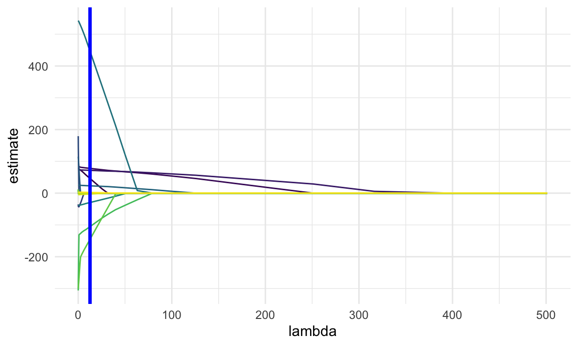
The next plot shows the CV curve itself. This is relatively shallow – having nothing at all in your model isn’t great, but you can get reasonable predictions from models that have “too many” predictors.
lasso_cv |>
  broom::tidy() |>
  ggplot(aes(x = log(lambda, 10), y = estimate)) +
geom_point() 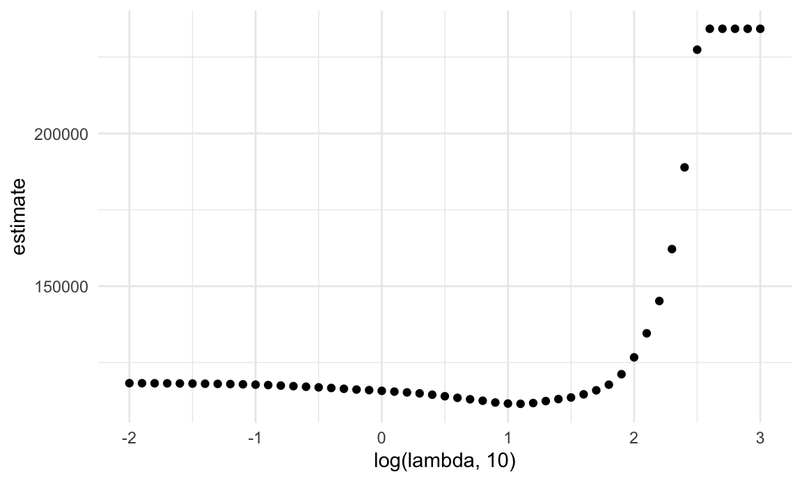
The coefficients from the optimal model are shown below.
lasso_fit =
  glmnet(x, y, lambda = lambda_opt)

lasso_fit |> broom::tidy()
## # A tibble: 12 × 5
## term step estimate lambda dev.ratio
## <chr> <dbl> <dbl> <dbl> <dbl>
## 1 (Intercept) 1 -3659. 12.6 0.627
## 2 babysexfemale 1 46.2 12.6 0.627
## 3 bhead 1 77.9 12.6 0.627
## 4 blength 1 71.8 12.6 0.627
## 5 fincome 1 0.252 12.6 0.627
## 6 gaweeks 1 23.1 12.6 0.627
## 7 malformTRUE 1 447. 12.6 0.627
## 8 menarche 1 -29.4 12.6 0.627
## 9 mraceblack 1 -105. 12.6 0.627
## 10 mracepuerto rican 1 -145. 12.6 0.627
## 11 smoken 1 -2.62 12.6 0.627
## 12 wtgain 1 2.32 12.6 0.627To be clear, these don’t come with p-values and it’s really challenging to do inference. These are also different from a usual OLS fit for a multiple linear regression model that uses the same predictors: the lasso penalty affects these even if they’re retained by the model.
A final point is that on the full dataset, lasso doesn’t do you much good. With ~4000 datapoints, the relatively few coefficients are estimated well enough that penalization doesn’t make much of a difference in this example.
Clustering: pokemon
For the first clustering example, we’ll use a dataset containing
information about pokemon. The full dataset contains several variables
(including some that aren’t numeric, which is a challenge for clustering
we won’t address). To make results easy to visualize, we look only at
hp and speed; a scatterplot is below.
poke_df =
  read_csv("data/pokemon.csv") |>
  janitor::clean_names() |>
  select(hp, speed)
## Rows: 800 Columns: 13
## ── Column specification ───────────────────────────────────────────────────────────────────────────────
## Delimiter: ","
## chr (3): Name, Type 1, Type 2
## dbl (9): #, Total, HP, Attack, Defense, Sp. Atk, Sp. Def, Speed, Generation
## lgl (1): Legendary
##
## ℹ Use `spec()` to retrieve the full column specification for this data.
## ℹ Specify the column types or set `show_col_types = FALSE` to quiet this message.poke_df |>
ggplot(aes(x = hp, y = speed)) +
geom_point()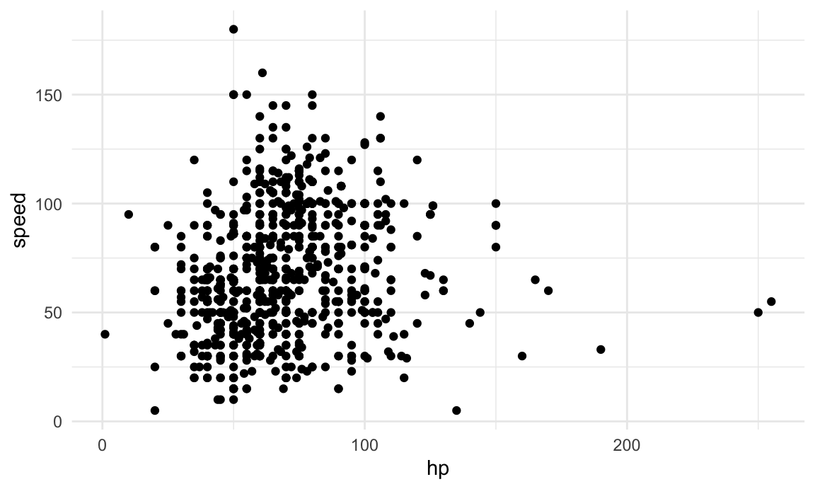
K-means clustering is established enough that it’s implemented in the
base R stats package in the kmeans function.
This also has a bit of an outdated interface, but there you go. The code
chunk below fits the k-means algorithm with three clusters to the data
shown above.
kmeans_fit =
  kmeans(x = poke_df, centers = 3)
More recent tools allow interactions with the kmeans
output. In particular, we’ll use broom::augment to add
cluster assignments to the data, and plot the results.
poke_df =
  broom::augment(kmeans_fit, poke_df)

poke_df |>
  ggplot(aes(x = hp, y = speed, color = .cluster)) +
  geom_point()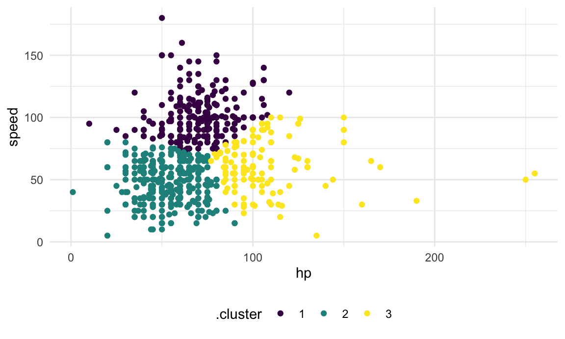
Clusters are broadly interpretable, but this still doesn’t come with inference. Also, at boundaries between clusters, the distinctions can seem a bit … arbitrary.
The code chunk below maps across a few choices for the number of clusters, and then plots the results.
clusts =
  tibble(k = 2:4) |>
  mutate(
    km_fit =    map(k, \(n_clust) kmeans(poke_df, centers = n_clust)),
    augmented = map(km_fit, \(fit) broom::augment(x = fit, poke_df))
  )

clusts |>
  select(-km_fit) |>
  unnest(augmented) |>
  ggplot(aes(hp, speed, color = .cluster)) +
  geom_point(aes(color = .cluster)) +
  facet_grid(~k)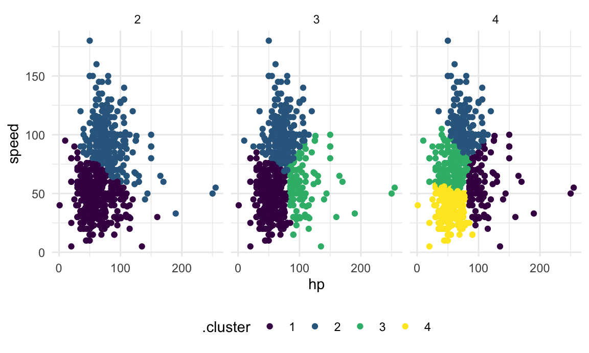
There are metrics that can suggest which of these is the better choice, but we won’t get into that.
Clustering: penguins
As a quick example of when clustering is more visually obvious, we’ll
take a look at data
“collected and made available by Dr. Kristen Gorman and the Palmer
Station, Antarctica LTER, a member of the Long Term Ecological Research
Network.” You may need to install the palmerpenguins
package to see this example. First we’ll load the data and do some
initial tidying to keep the variables of interest and remove rows with
missing values. We’ll then make a quick visualization of bill length vs
flipper length.
library(palmerpenguins)##
## Attaching package: 'palmerpenguins'## The following objects are masked from 'package:datasets':
##
## penguins, penguins_rawdata("penguins")
penguins =
penguins |>
select(species, bill_length_mm, flipper_length_mm) |>
drop_na()
penguins |>
ggplot(aes(x = bill_length_mm, y = flipper_length_mm, color = species)) +
geom_point()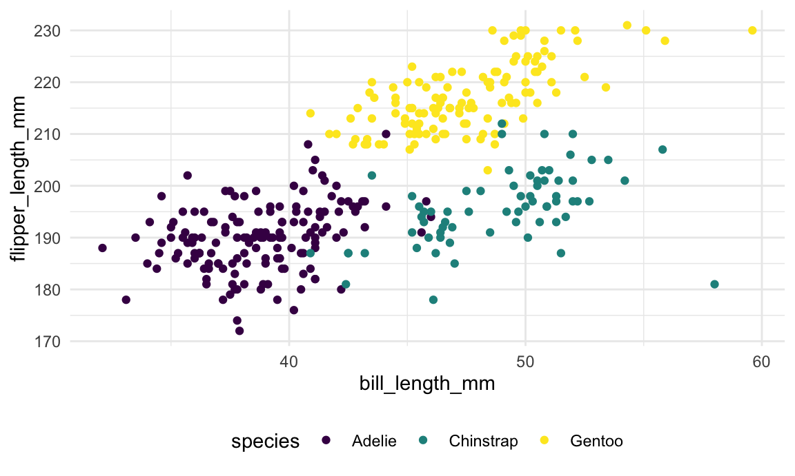
We’ll again use kmeans to identify clusters in a
data-driven way. We remove the species variable and rescale
the remaining columns, since kmeans is sensitive to
different scales for the input variables. The results are shown in the
next plot.
kmeans_fit =
  penguins |>
  select(-species) |>
  scale() |>
  kmeans(centers = 3)

penguins |>
  broom::augment(kmeans_fit, data = _) |>
  ggplot(
    aes(x = bill_length_mm, y = flipper_length_mm,
        color = .cluster, shape = species)) +
  geom_point(size = 2)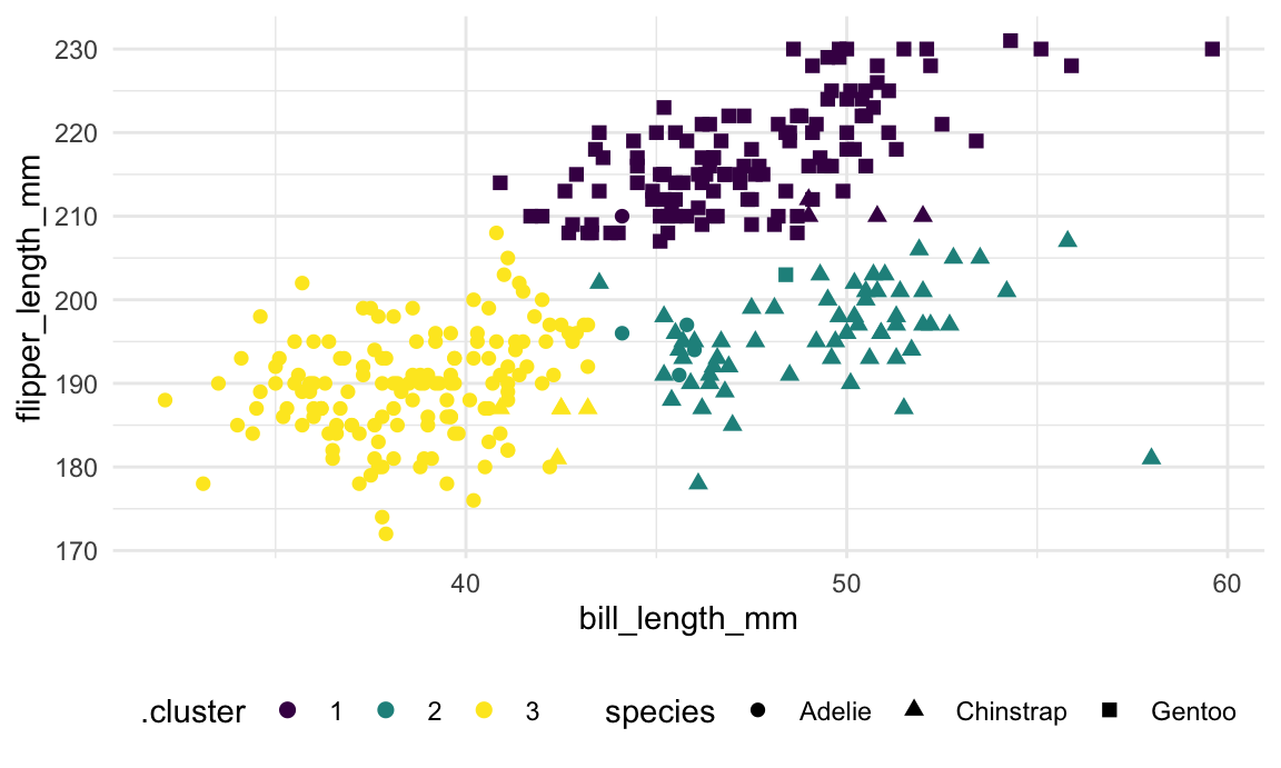
As shown in the table below, the data-driven clusters don’t perfectly
correspond to the penguins’ species, but the alignment is pretty good.
This is helpful for illustrating a good use-case for clustering – if the
species variable didn’t exist, clustering would provide a
pretty good classification of observed data that simplifies the more
complex structure for bill and flipper length.
penguins |>
  broom::augment(kmeans_fit, data = _) |>
  count(species, .cluster) |>
  pivot_wider(
    names_from = .cluster,
    values_from = n,
    values_fill = 0)
## # A tibble: 3 × 4
## species `1` `2` `3`
## <fct> <int> <int> <int>
## 1 Adelie 1 4 146
## 2 Chinstrap 4 59 5
## 3 Gentoo 122 1 0Clustering: trajectories
A final clustering example uses longitudinally observed data. The process we’ll focus on is:
- for each subject, estimate a simple linear regression
- extract the intercept and slope
- cluster using the intercept and slope
Below we import and plot the trajectory data.
traj_data =
  read_csv("data/trajectories.csv")
## Rows: 1600 Columns: 3
## ── Column specification ───────────────────────────────────────────────────────────────────────────────
## Delimiter: ","
## dbl (3): subj, week, value
##
## ℹ Use `spec()` to retrieve the full column specification for this data.
## ℹ Specify the column types or set `show_col_types = FALSE` to quiet this message.traj_data |>
ggplot(aes(x = week, y = value, group = subj)) +
geom_point() +
geom_path()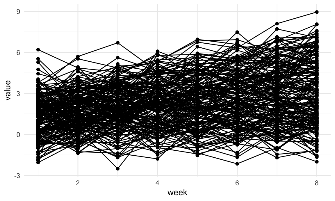
Next we’ll do some data manipulation. These steps compute the SLRs, extract estimates, and format the data for k-means clustering.
int_slope_df =
  traj_data |>
  nest(data = week:value) |>
  mutate(
    models = map(data, \(x) lm(value ~ week, data = x)),
    result = map(models, broom::tidy)
  ) |>
  select(subj, result) |>
  unnest(result) |>
  select(subj, term, estimate) |>
  pivot_wider(
    names_from = term,
    values_from = estimate
  ) |>
  rename(int = "(Intercept)", slope = week)
A plot of the intercepts and slopes are below. There does seem to be some structure, and we’ll use k-means clustering to try to make that concrete.
int_slope_df |>
  ggplot(aes(x = int, y = slope)) +
  geom_point()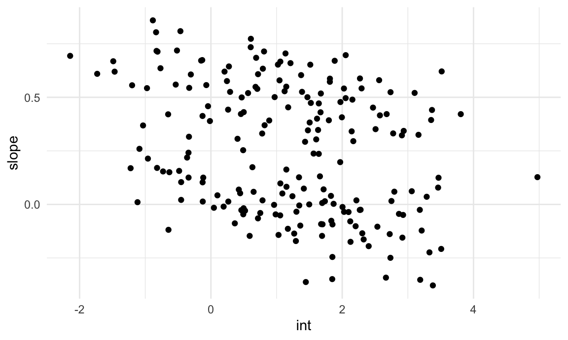
km_fit =
  kmeans(
    x = int_slope_df |> select(-subj) |> scale(),
    centers = 2)

int_slope_df =
  broom::augment(km_fit, int_slope_df)
The plot below shows the results of k-means based on the intercepts and slopes. This is … not bad, but honestly maybe not what I’d hoped for.
int_slope_df |>
  ggplot(aes(x = int, y = slope, color = .cluster)) +
  geom_point()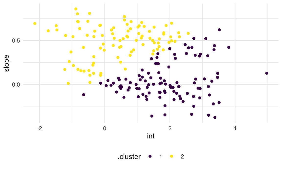
Finally, we’ll add the cluster assignments to the original trajectory data and plot based on this. Again, the cluster assignments are okay but maybe not great.
left_join(traj_data, int_slope_df) |>
  ggplot(aes(x = week, y = value, group = subj, color = .cluster)) +
  geom_point() +
  geom_path()
## Joining with `by = join_by(subj)`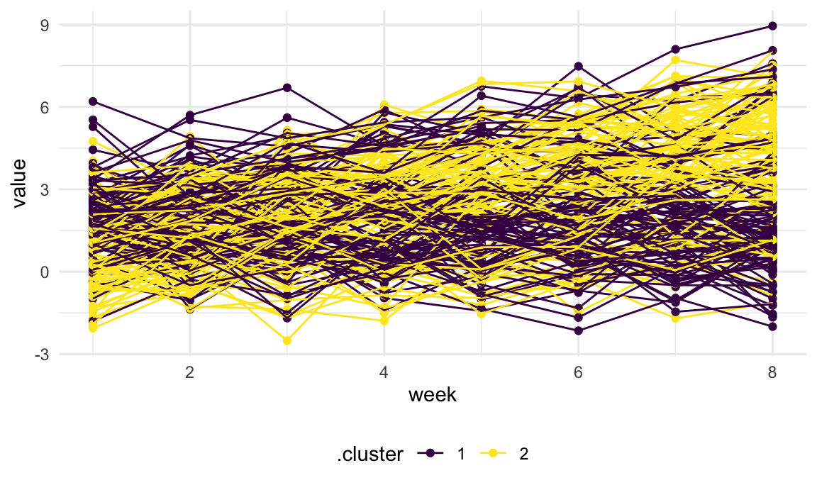
This example is very much related to “trajectory analysis”, which has
become pretty popular recently (maybe because PROC TRAJ
exists in SAS …). The basic idea is to use tools from longitudinal data
analysis to estimate trajectories underlying data – mixed models rather
than SLRs. The subject-level estimates (random effects) are then
clustered; cluster means are hopefully interpretable, and cluster
assignments are thought to be meaningful. In many cases, though, the
distinction between groups is fairly arbitrary.
Other materials
- Intro to Statistical Learning with R, chapters 6 and 10
- Nice shiny app for k-means
- Good overview of clustering
- Some discussion about tidying results
The code that I produced working examples in lecture is here.