Plotly and flexdashboard
Plotly is a flexible framework for producing interactive graphics; it
has a variety of implementations, including one for R. We’ll take a look
at a few common plot types, and then introduce
flexdashboards as a way to collect plots (either static or
interactive).
This is the second module in the Interactivity topic.
Overview
Learning Objectives
Create interactive graphics using plot.ly and design a data dashboard
using flexdashboard.
Video Lecture
Example
For this example, I’ll create a new .Rmd file that knits to .html in
the repo / R Project holding the website I made in making websites. In addition to some
usual packages, I’ll load plotly.
library(tidyverse)
library(p8105.datasets)

library(plotly)
##
## Attaching package: 'plotly'## The following object is masked from 'package:ggplot2':
##
## last_plot## The following object is masked from 'package:stats':
##
## filter## The following object is masked from 'package:graphics':
##
## layoutWe’re going to focus on the Airbnb data for this topic. The code below extracts what we need right now; specifically, we select only a few of the variables and filter to include a subset of the data. In part, this makes sure that the resulting dataset and plots are computationally feasible – for large datasets, you may need to downsample.
data(nyc_airbnb)

nyc_airbnb =
  nyc_airbnb |>
  mutate(rating = review_scores_location / 2) |>
  select(
    neighbourhood_group, neighbourhood, rating, price, room_type, lat, long) |>
  filter(
    !is.na(rating),
    neighbourhood_group == "Manhattan",
    room_type == "Entire home/apt",
    price %in% 100:500)
We’ll use this dataset as the basis for our plots.
Plotly scatterplot
There are several practical differences comparing ggplot
and plot_ly, but the underlying conceptual framework is
similar. We need to define a dataset, specify how variables map to plot
elements, and pick a plot type.
Below we’re plotting the location (latitude and longitude) of the
rentals in our dataset, and mapping price to color. We also
define a new variable text_label and map that to text.
The type of plot is scatter, which has several “modes”:
markers produces the same kind of plot as
ggplot::geom_point, lines produces the same
kind of plot as ggplot::geom_line.
nyc_airbnb |>
  mutate(text_label = str_c("Price: $", price, "\nRating: ", rating)) |>
  plot_ly(
    x = ~lat, y = ~long, type = "scatter", mode = "markers",
    color = ~price, text = ~text_label, alpha = 0.5)
This can be a useful way to show the data – it gives additional information on hovering and allows you to zoom in or out, for example.
Plotly boxplot
Next up is the boxplot. The process for creating the boxplot is
similar to above: define the dataset, specify the mappings, pick a plot
type. Here the type is box, and there aren’t modes to
choose from.
nyc_airbnb |>
  mutate(neighbourhood = fct_reorder(neighbourhood, price)) |>
  plot_ly(y = ~price, color = ~neighbourhood, type = "box", colors = "viridis")
Again, this can be helpful – we have a five-number summary when we hover, and by clicking we can select groups we want to include or exclude.
Plotly barchart
Lastly, we’ll make a bar chart. Plotly expects data in a specific
format for bar charts, so we use count to get the number of
rentals in each neighborhood (i.e. to get the bar height). Otherwise,
the process should seem pretty familiar …
nyc_airbnb |>
  count(neighbourhood) |>
  mutate(neighbourhood = fct_reorder(neighbourhood, n)) |>
  plot_ly(x = ~neighbourhood, y = ~n, color = ~neighbourhood, type = "bar", colors = "viridis")
Interactivity in bar charts is kinda neat, but needs a bit more justification – you can zoom, which helps in some cases, or you could build in some addition information in hover text.
ggplotly
You can convert a ggplot object straight to an
interactive graphic using ggplotly.
For example, the code below recreates our scatterplot using
ggplot followed by ggplotly.
scatter_ggplot =
  nyc_airbnb |>
  ggplot(aes(x = lat, y = long, color = price)) +
  geom_point(alpha = 0.25) +
  coord_cartesian()

ggplotly(scatter_ggplot)
We can recreate our boxplot in a similar way.
box_ggplot =
  nyc_airbnb |>
  mutate(neighbourhood = fct_reorder(neighbourhood, price)) |>
  ggplot(aes(x = neighbourhood, y = price, fill = neighbourhood)) +
  geom_boxplot() +
  theme(axis.text.x = element_text(angle = 90, hjust = 1))

ggplotly(box_ggplot)
If I really want an interactive plot to look good, I’ll use
plot_ly to build it – ggplot was designed with
static plots in mind, and the formatting and behavior of
ggplotly is less visually appealing (to me) than
plot_ly.
I use ggplot for static plots, and I make static plots
way, way more frequently than interactive plots. Sometimes I’ll
use ggplotly on top of that for some quick interactivity;
this can be handy to do some zooming or inspect outlying features.
flexdashboard
Clearly you can embed interactive graphics in HTML files produced by R Markdown; this is a handy time to introduce dashboards. In short, dashboards are a collection of related graphics (or tables, or other outputs) that are displayed in a structured way that’s easy to navigate.
You can create dashboards using the flexdashboard
package by specifying flex_dashboard as the output format
in your R Markdown YAML. There are a variety of layout options, but
we’ll focus on a pretty simple structure produced by the template below.
This is the default dashboard template in R Studio – if you have
flexdashboard installed, you can use
File > New File > R Markdown > From Template to
create a new .Rmd file with the structure below.
---
title: "Untitled"
output:
  flexdashboard::flex_dashboard:
    orientation: columns
    vertical_layout: fill
---

```{r setup, include=FALSE}
library(flexdashboard)
```

Column {data-width=650}
-----------------------------------------------------------------------

### Chart A

```{r}

```

Column {data-width=350}
-----------------------------------------------------------------------

### Chart B

```{r}

```

### Chart C

```{r}

```
Conveniently, this dashboard has space for three plots! We’ll
populate it using the plot_ly plots above; doing so
produces a graphic like the one shown below.
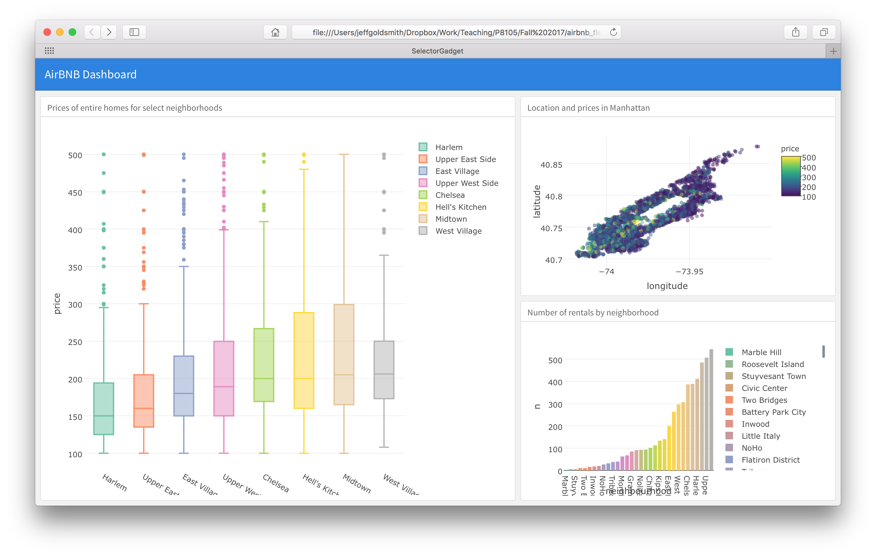
Dashboard layouts are controlled by specifying columns and rows, and potentially subdiving these. We specified a two-column layout with set column widths, and then divided the second column into two panels. Using tabbed browsing and multiple pages can also be really useful – check out the gallery linked below for examples!
flexdashboards on websites
You can share the HTML files for dashboards directly (e.g. by email); you can also host these online to make the dashboard visible to others. That process is essentially the same as for any other website you’d make.
However, the website’s _site.yml file conflicts with the
dashboard’s YAML header regarding the output format – and
the website’s _site.yml “wins”. To address this issue,
instead of knitting you can use this command to knit the dashboard.
rmarkdown::render("dashboard_template.Rmd", output_format = "flexdashboard::flex_dashboard")This will create dashboard_template.html but not open it
in RStudio’s Viewer pane; you can open the file in a browser instead.
Alternatively, using RStudio’s Build pane to Build Website will produce
the same results. To illustrate, we’ll put the dashboard we just created
on a website for this topic.
All of this YAML business is only an issue for
dashboards embedded in websites; a standalone dashboard (in a
non-website GH repo or R Project) can be knit using the same process as
other .Rmd files.
Other materials
- Plotly can take a while to get used to; starting with their library and reference can help. I also like the cheatsheet
- Dashboards are pretty well-supported. Check out the overview, layout discussion, and examples
- There are cool dashboards all over. To get a sense of how these work
in the real world, check out:
- This app for understanding power (blog post here);
- 538’s p-hacking tool (full article here).
The code that I produced working examples in lecture is here.